Horinger New Area unveils official logo


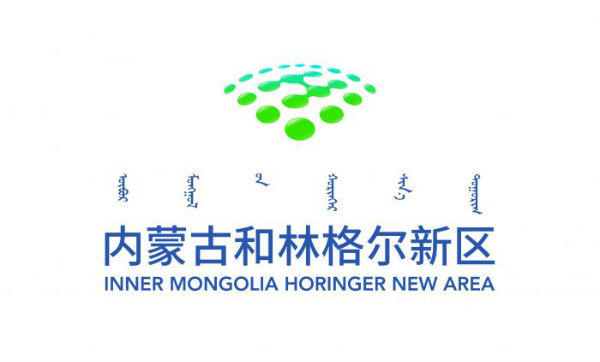
Official logo of Horinger New Area [Photo/hhhtnews]
The government of Horinger New Area in Hohhot, in Inner Mongolia autonomous region, unveiled its official logo on May 5.
Officials said that the first letter of Horinger is placed in the center of the logo and has the implication of harmony, cooperation, integration and connection.
The logo resembles a fan, with 20 dots arranged in a matrix, representing industries -- especially the emerging internet, artificial intelligence and big data sectors, as well as the manufacturing, new materials and pharma industries -- that are being drawn to the Horinger New Area.
The green dots in the logo also represents Horinger New Area's strategy of giving priority to ecological environment and green development.
According to the government, the newly unveiled logo will be widely promoted across the area.
With a planned area of 496 square kilometers, Horinger New Area was established in 2017. It covers Xincheng district, Saihan district, Tumd Left Banner, Horinger county, Togoth county and Qingshuihe county in Hohhot. Officials said that it is an economic transformation area in the city, where big data industries have the top priority for development.


