Pearl Bay's latest city image logo released


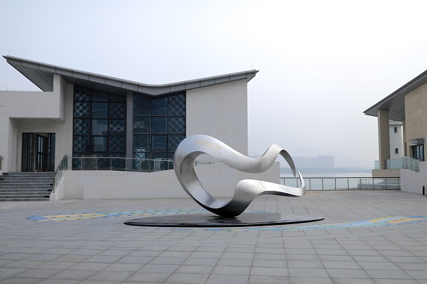
The logo of Lingshan Island Point Area in the Pearl Bay Area [Photo/gznsnews.com.cn]
A city brand is like a harmonious and beautiful song, which can fully demonstrate the integrity, consistency and uniqueness of regional characteristics. After the completion of municipal and public facilities construction, the Lingshan Island Point Area in the Pearl Bay Area has developed a fitting new logo. The new logo is a sculpture made of stainless steel that looks like a capital M in the upper part and a capital W in the lower part.According to reports, the logo design fully refines the initial character of the three Chinese Pinyin words meaning Pearl Bay--- Ming Zhu Wan. The twisted ring reveals the Z letter, which is a unique symbol of the Pearl Bay area.

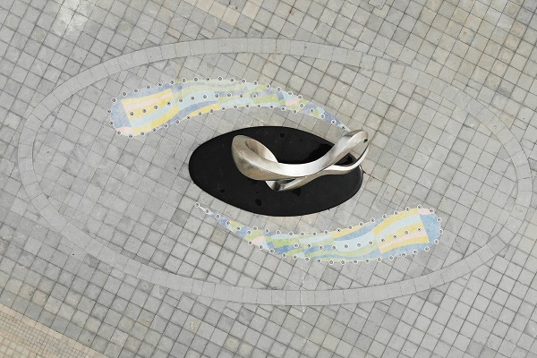
The logo of Lingshan Island Point Area in the Pearl Bay Area [Photo/gznsnews.com.cn]
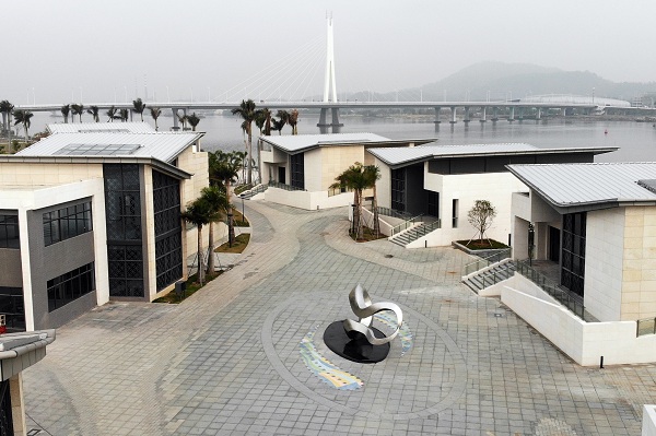
The logo does not simply incorporate clear and concise graphic features. The designer extracts the unique “mountain, water, city, and bay” elements and combines the strategic positions of the Nanhai Charm Bay Area, the economic and financial headquarters, the 21st Century Maritime Silk Road Hub, Lingnan Diamond Water Town, and Ecological Smart City.
The sculpture expresses the unique geographical features of the Pearl Bay Area. The distribution points of the four major groups in the Pearl Bay area are used as the structural support points of the geometric shape. The circular body is twisted and enclosed, which reflects the waters surrounding the Pearl Bay Area.
The dynamic form echoes the special terrain of the "Five Waters Bay and the Three Rivers and Six Banks". It reflects the urban traits in multiple dimensions and spreads the dreams of the Pearl Bay Area and the brand positioning of building a home in a fascinating waterfront.

The logo of Lingshan Island Point Area in the Pearl Bay Area [Photo/gznsnews.com.cn]
The sculpture is only one of the forms of concrete expression of the symbol, which can also be applied to multiple scenes. Therefore, in terms of the color, the design side also results from in-depth research. The blue and green gradient fusion expresses the idea of green mountains and clear water and the mountains and rivers embrace and blend with each other. The logo is matched with blue in the lower right corner. The words “Ming Zhu Wan” and “PEARL BAY” create an inclusive, developable and dynamic logo vision.
MOST POPULAR
- 1 China to give visa-free treatment to another 9 countries
- 2 China fully opens manufacturing sector to foreign investors in landmark opening up move
- 3 China's import expo attracts record-breaking participating countries, exhibitors
- 4 China's door opening even wider to foreign visitors, businesses
- 5 China revises rules to ease foreign strategic investment in listed firms
Editors' Picks
 Video:
Peru sees new port open
 Infographic:
China's public holidays for 2025
 Infographic:
Basic facts of APEC
 Infographic:
Wrapping up the 7th CIIE: Data recap


